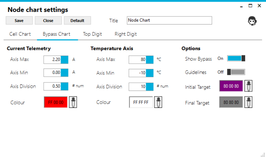
¶ Bypass Chart
The Bypass Chart will show you the bypass status of your cell monitors as they have been set up.

¶ Customize
You can customise the settings by clicking on the settings button on the bottom right-hand side of the Node Chart.

¶ Select Bypass Chart Tab
Ten values can be set up across the top of the chart. These are the default ones that are given if you don't choose to customise.

¶ Current
Current is measured in Amps when the cells are in bypass. Minimum and Maximum as well as axis divisions can be set to suit your environment.
¶ Temperature
Temperature is the right-hand side axis of the chart. The measurements for each cell are shown on the chart as a triangle, the colour of the triangle can be changed. Minimum and Maximum as well as axis divisions can be set to suit your environment.
¶ Options
More Chart options can be set, with the colour for Low Alert and High Alert can be set as well.