¶ Node Cell Chart
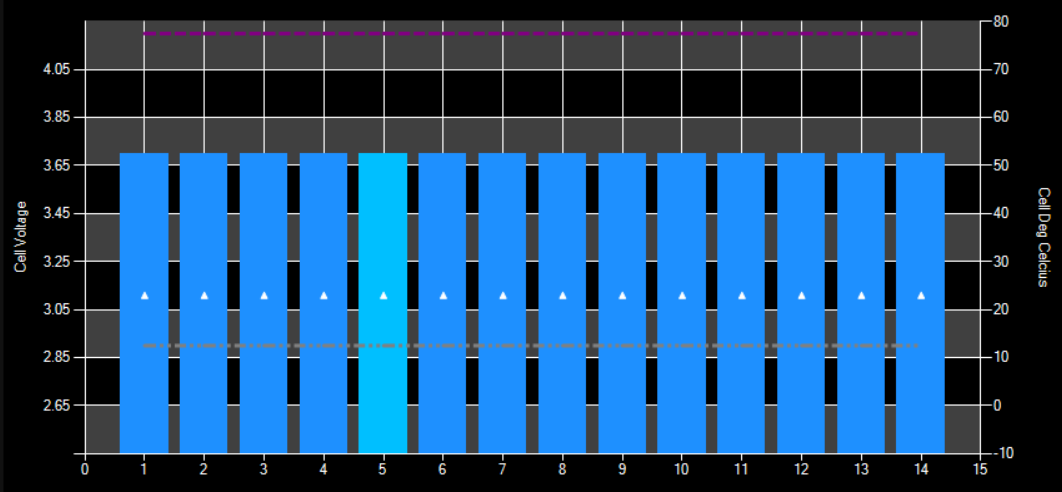
The Cell Chart will show you the status of your cell monitors as they have been set up.

¶ Customize
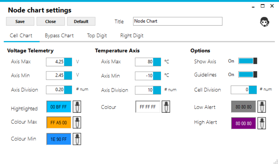
You can customise the settings by clicking on the settings button on the bottom right-hand side of the Node Chart.

¶ Select Cell Chart Tab
Ten values can be set up across the top of the chart. These are the default ones that are given if you don't choose to customise.

¶ Voltage
Voltage is the left-hand side axis of the chart. Minimum and Maximum as well as axis divisions can be set to suit your environment. There is one column for each cell monitor that indicates the voltage of that cell. Customising the Colour Max and Colour Min stand out can help you easily identify when a cell needs attention.
- Cell Voltage Max is typically set to Orange and only shown when different to the minimum. This typically occurs on LongMons to show the range from the cell between updates.
- Cell Voltage Minimum is typically set to Blue.
- Cell Voltage Light Blue is the most recent record since the update.
¶ Temperature
Temperature is the right-hand side axis of the chart. The measurements for each cell are shown on the chart as a triangle, with the colour of the triangle changeable. Minimum and Maximum as well as axis divisions can be set to suit your environment.
¶ Options
More Chart options can be set, with the colour for Low Alert and High Alert can be set as well.
¶ Examples: